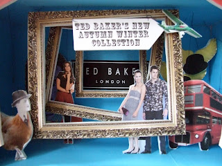


 This is my final set, I've combined the best aspects of sets number 4 and 5. I'm not entirely happy with the outcome of this set; the props and mixed themes look disjointed and confused. I'm beginning to wonder if set number 5 - the Monty Python set - was the best. The gilded frames detract from the other aspects of the display, hiding the quirkier concepts such as the bus, the winged bowler hats and the Monty Python-ised illustration of Johnny Rotten on the left hand side. I also think that an extra mannequin at the front might help the muddled composition.

 After someone suggested that I could get away with using one logo that needn't have to fill up the gilded frame, I thought I'd try it out. At first glance, I thought that I could black out the background, but then thought that matching it to the purple would work better. I definitely prefer this later version opposed to the first edit with the logo layered on top of each other. It's simple and doesn't look cluttered. Furthermore the composition of the frames getting smaller and smaller draws your eyes to the mannequins and the logo situated at the back.


 These have been roughly edited on Photoshop, the motivation to make them look good is quickly diminishing in the early hours of the morning...


 Have gone very British with this third set, however I have still stuck with previous themes of British nostalgia; i.e. bowler hats, umbrellas and London in the 1960s. I have yet to attach a sheet of acetate, and experiment with font to publicise Ted Baker's new Autumn/Winter collection. Here I have used two actual Ted Baker models to represent the positioning of the mannequins.

